 6 Artwork Mistakes to Avoid
One of the most important elements of screen printing is using high quality art, as this will enable you to create eye-catching prints that are sharp, crisp, clear, and bold. High resolution art can help your shop looking professional and your prints staying high quality.
1. Not Double-Checking Your Artwork.
Don’t forget to do a quality artwork check. Finding spelling and grammatical errors prior to printing the film of your artwork and overlooking the customers instructions are essential. This will guarantee you are following proper protocol as far as the look and feel of the artwork, whether it be a vintage look or a sharp one. Halftone details, dot-gain compensations, gradient overlays, as well as the density and transparency of the artwork colors should all be on your checklist as well. The few minutes to look over mistakes will save time and money in the long run. Always do a test-run prior to printing the entire job to ensure that there are no artwork mistakes.
2. Using a Low Quality Art File.
Guarantee that you are using high resolution at 300dpi in order to obtain results that have a crisp and clear print. If you start with low quality the file will end up printing too small or in the wrong format for the job, finishing with sub-par work. There is no way around this, but starting from scratch.
3. Not Re-Creating Low Quality Artwork Designs from Scratch or Providing Guidelines for Artwork Sent.
It can be tempting to work with what clients give you, but from personal experience, re-creating their low quality artwork file provided or requesting a higher resolution JPG or PSD of the file is essential. If you don’t than this can do your customers a disservice. Maintaining standards for the artwork provided and accepted from customers, making clear guidelines, and holding customers to them will only help your customers. They will thank you for providing them with a high-quality finished product.
4. Not Using Our Pigment Based Matching System and the Pantone Book.
The best way to get the specific colors that your customers are looking for is to use our easy to use Pigment Based Matching System. You need a pantone book in order to know the exact colors that your customer wants, as no two monitors are the same. Our formulas for our matching system contain 10% of our pigment concentrate colors and 90% base.
Get started with our Start up Kit.
– 13 Quarts of Pigment Components
– 5 Gallons of Base
– 1 Gallon of Reducer
View our prices by clicking here!
5. Not Having a Back-Up Source for Your Art Department.
Regardless of your art departments abilities, having a back up source on file to call if your art department gets overwhelmed is essential. This company will be able to help your art department if orders are piling with complicated or time-consuming separations in that you might have to turn down a job.
6. Not Improving Your Art Skills
Screen printing wonderful, crisp, and clear prints starts with great artwork. If you improve your artwork skills by simply watching videos on Youtube or taking online courses, especially if you are new to screen printing, this will only help your shop improve and avoid misprints.
In order to complete a finished look on garments that your customers will love, our tips will help!
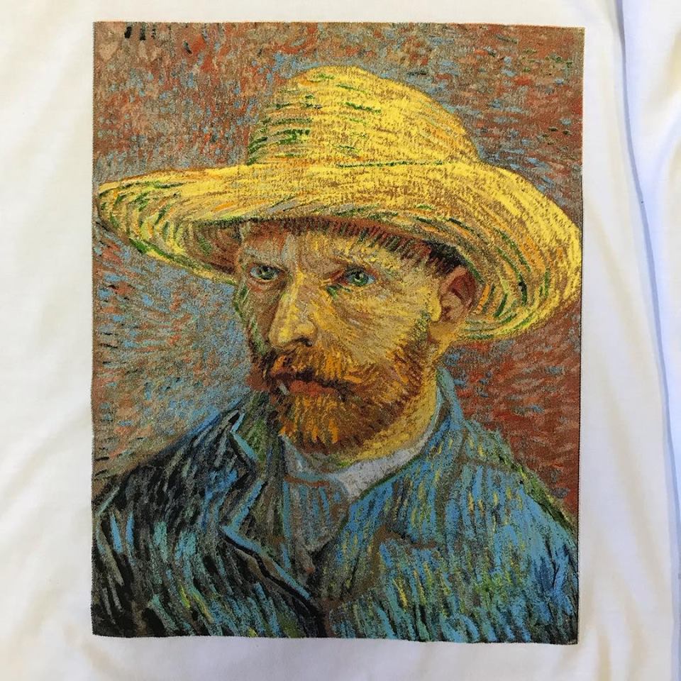
In the comment section, guess how many color imprints we used of low temperature ink on this 100% cotton t-shirt!
 Our low temperature ink will work on all fabrics. Please click on the image above to read more about our Fusion 180 ink.
Code: SAVE20
FREE domestic freight at $150
Please click on the image to shop.
